
Apple Music unveils logo physically shaped by sound through oil
Apple has unveiled the first rebrand of its Apple Music service, a wave-like logo created by passing music frequencies through a pool of mineral oil, made in collaboration with the musician Fred Again.
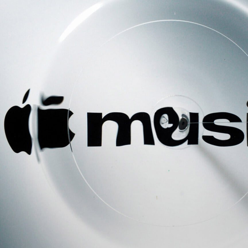
Apple has revealed the first rebrand of its Apple Music service, a wave-like logo produced by passing musical frequencies through a shallow pool of mineral oil. The project was made in collaboration with the musician Fred Again and marks the first visual overhaul of the service since it launched in 2015.
According to Apple, the central idea was to give Apple Music a distinctive sound and to create a logo that was, in the company's words, «made by sound». The company said the logo would be used across its marketing. «For the rebrand of Apple Music, we wanted sound to create the visuals,» Apple said. «How do we take this idea of music and distill it into something visually beautiful?»
A video released by Apple showed the process. An icon-shaped piece of plastic was placed in a shallow pool of mineral oil. Musical frequencies created by Fred Again, in collaboration with NEST Acoustics, were translated into physical vibrations using a transducer. These vibrations moved the oil and produced the wave-like effect that now forms the logo. «Essentially, the idea was to create the perfect sound wave,» Apple said. «We take a frequency and we play it through a rig. This rig then moves a large amount of liquid at the frequency of the notes.» The company added that it had partnered with one of the world's leading music artists to create the notes for the final mnemonic, and then used that sound to create the visuals.
The physical method stands in contrast to the wider creative landscape, in which digital design and artificial intelligence are increasingly at the forefront of creative processes. The rebrand was built around that contrast: rather than generating the visuals on a screen, the team turned an audio signal into a tangible, liquid form that could be photographed and reproduced.
The wave-like overlay sits alongside a revised typography. The lowercase «m» in music has been adopted, and the wordmark uses a custom version of Apple's SF Pro typeface in an entirely lowercase, bold letterform. Sat alongside the Apple icon, these changes align the Apple Music identity with wider Apple visual branding.
Apple unveiled the new logo last week alongside an additional musical note icon. The identity had been teased earlier in the month, when the company revealed its Apple Music Hall venue in Battersea, London. The logo is placed on a wall within the venue, which has an industrial aesthetic that matches the renovated power station it occupies. The rebrand therefore appears first in the physical space of the venue and then across the service's marketing, with the sound-made logo serving as the connecting visual thread between the two.
6