
Fieldwork Facility designs Gen Z-inspired wayfinding for V&A East Storehouse
A Hackney design studio has created signage for the V&A East Storehouse modelled on Gen Z apps, aiming to draw in younger and more diverse visitors. The project has been shortlisted for a Dezeen Award.
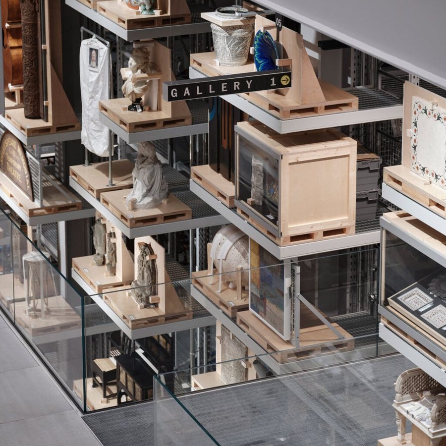
Hackney design studio Fieldwork Facility has created the wayfinding system for the V&A East Storehouse, drawing its visual language from the apps that define the daily digital habits of Generation Z. The project has been shortlisted in the graphic design category of the Dezeen Awards, although the winner has not yet been announced.
The Storehouse, designed by Diller Scofidio + Renfro and completed last May, opens the museum's vault to the public for the first time, giving access to around 250,000 objects. The studio's founder, Robin Howie, led the project with a clear aim: to encourage younger and more diverse visitors who may feel excluded from traditional museum spaces. Rather than treating the signage as a conventional set of directions, the team approached it as a means of making the building feel welcoming and easy to navigate.
The central idea treats the building as an operating system. Gen Z apps such as TikTok served as the model, and visitors are greeted with an onboarding text, much like the first screen someone sees when opening a new app. This introduction combines printed type, ticker-style screens and tiles made from recycled paper, setting a tone that is informal and interactive rather than formal and hushed.
Colour is used to orient visitors across the site. Yellow marks the viewing galleries, green identifies the restoration labs, and pink denotes the Study Centre. The pink zone also offers Order an Object access, a service normally reserved for researchers, which allows visitors to request items from the collection. Signage is therefore not only a guide to space but also an indicator of what kinds of engagement are available in each area.
The physical signage system is built from modular paper tiles, each carrying a single letter, so that displays can be rearranged as exhibitions change. The team created a bespoke monospaced version of the V&A typeface designed by Spiller, and lava-stone colour discs echo the three zone colours. Interpretation labels were designed to fit standard crates, palettes and forklift shelving, reflecting the working environment of a storehouse rather than a conventional gallery.
Practical considerations shaped many decisions. Digital templates allow museum staff to edit labels without needing the designers, so the system can evolve independently after installation. Permanent icons are painted or screen printed instead of applied as disposable vinyl, a choice intended to reduce waste and extend the life of the graphics. The designers also included expression points, where visitors can give their opinions or vote with coins, turning passive viewers into participants.
The project's shortlisting places it among seven rival projects in the same category, and the outcome remains open. Its ambition, however, is clear: to show that a major institution can speak the visual language of its younger audiences while still presenting its collection with care and authority.
Source: dezeen.com
123